
Pillars
Self Care Resource - Native iOS Application
TEAM: Alisa Price, Lauren Friedman, Leobardo Gudino Garcia
TOOLS: Paper, Google Suits, Miro, Figma
TIME FRAME: 2 Weeks
ROLE: Assisted in all parts equally, main focus was on UI design of On Boarding process
BRIEF: Identify an opportunity in a problem space and select an appropriate platform to design a solution.
SOLUTION: The team choose self-care as the problem space based on a collective interesting in how users currently define and conduct self-care during the pandemic.
OVERVIEW: Pillars is an application that helps users discover and track self-care activities.
Research
We began our search for understanding users needs in the self-care space by sending out a screen servery. We decided to narrow down our potential interview candidates by selecting those who chose Emotional when asked what areas of self care would you be interested in and yes to wanting to practice self-care more consistently.
During the interviews we wanted to gain an idea of what self-care means to each individual, how often they currently practiced any self-care activities, and if they use anything to manage or assist with self-care practices.

We took the information we got from the interviews and mapped them out on sticky notes, giving each user their own color. From this we started to identify trends. Once we gathered the information into these overall trends we could break down an overall take away for each topic and pull insights. The insights we gathered from users during these interviews were:
The term “self-care” is defined differently depending on the user.
Users feel most self-care apps are singularly focused and many do not use them.
Users struggle to stay motivated to practice self-care due to a lack of accountability.
With our insights narrowed down, we could begin to build a persona. Pulling a summation of demographic and behavioral information from our interviewees, we created Jess.

Identify Problem
From the research we conducted, we were able to identified a problem that would help guide us in our process:
Users need a way to discover and maintain self-soothing habits so they can access and utilize them when faced with anxieties and stressors.
This helped us begin hypothesizing ways we could address user needs. Defining self-care, offering accountability, and a broad focus of self-care activities were the main focus of user needs we wanted to take on. We needed to look at the current market to see how similar problems were currently being solved within this space and where opportunities existed for us to stand out with our solutions.
Business Analysis
We conducted a comparative analysis to get a better understanding of what the market landscape looks like, what key features are included in successful apps, and where our opportunities lie. Our analysis led us to focus on three areas: Educate, Discover, and Track.
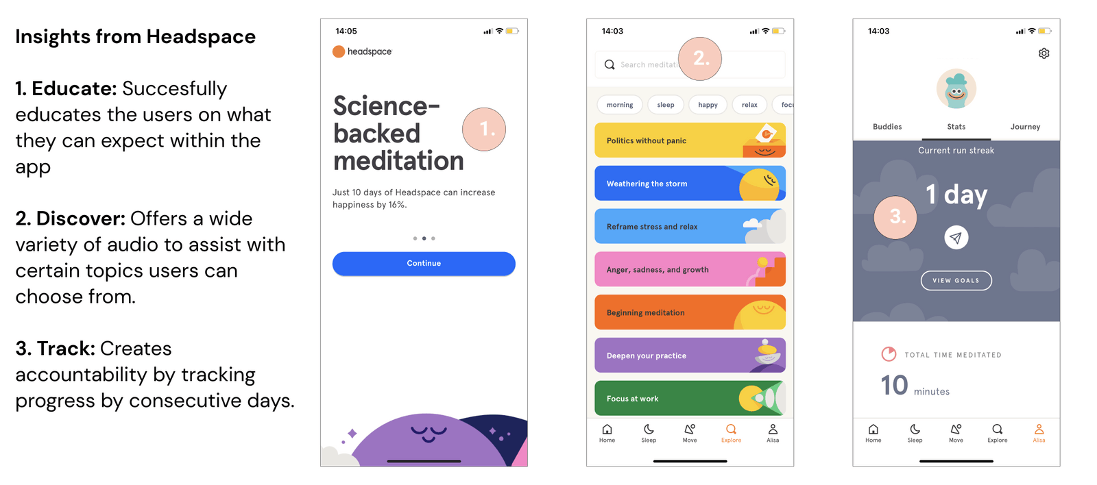

We created a competitive matrix to see where our app would fall within the current market with the focus we have decided on and how we could tailor that more to the opportunities that exist in the gap of the current market.

Journey Map
With a user identified and after taking a look at the current market, we could created a journey map to better understand our user’s experience and find some key problem areas to focus on. This certainly helped keep a human perspective on the solution and assisted with feature ideas.

Ideate & Sketch
We conducted a design studio to brainstorm defining features of the app. Educate, discover, and track were key points we wanted to use as a guide with our design and early ideas of how they would be implemented came quickly to many on the team.

Early concepts for features in the app
We created a MoSCoW map to help prioritize features for the app. We had a lot of ideas that we wanted to include but due to the time frame, many of those ideas would need to be assessed on how important they were to answering the problem we were solving for our user.

Design
Wireframes

Creating an on boarding process for users was the approach we thought would be best for presenting information about the app. Laying out what our purpose is and what we consider self-care clears up any confusion users may have with their own personal understanding of self-care and its practices.
Defining what we classified as the areas of self-care was important so we gave definitions to each area that way users would clearly understand what each area means to us.


Giving users the option to sign up after providing information on what the apps intention is gives them time to consider if they want to commit to our product.
Allowing users to control notification alerts was an important feature in giving users control over the level of accountability the app can provide for them.
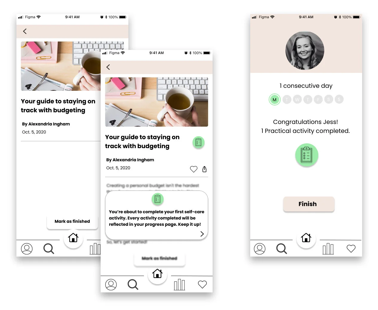
Providing a collection of different activities was very important to us so we developed a library that broke activities up by type with tags for the pillar they were associated with. Each activity, once selected, had an option to mark as complete and would be logged to you profile.


The tracking feature would be accessible from the main menu at the bottom and through the profile screen. We wanted to display progress to viewers in large and small time frames so we provided multiple options for users to see their logged activities. Each pillar would be displayed by their assigned color so users could easily see which areas they tend to focus on more.
Increased Fidelity
We added more clarity around who we are, what we do, and what self care means to us in the on boarding process following feedback. We also added warm and inviting colors with ambiguous illustrations to add a personality with the app right when user launches it.


Giving each pillar an associated color was important to us. We stayed with a warm, muted, and more neutral pallet for these to give a more calming and soothing feel to app. These colors will be used for each pillar throughout the app so users can more easily identify which activities are associated with which pillar.
We maintained the sign up process at the end of the on boarding and also kept the control over notifications. Keeping the information needed as direct as possible was always a focus with this process.


Providing an overview of content to discover with them broken up by which type of activity they are gives more clarity to the library we offer to users. Once the user selects the type of activity they will be taken to a landing page which will show more detail of what is provided, the title, time it takes to complete, and the pillar it is associated with.
Adding a tutorial with the completion of your first activity was something we felt would be helpful for users when starting out with our app. We got feedback that the process was fairly simple and straight forward but it was unclear where to view the logged information once an activity was completed so we added this to clear up that confusion.
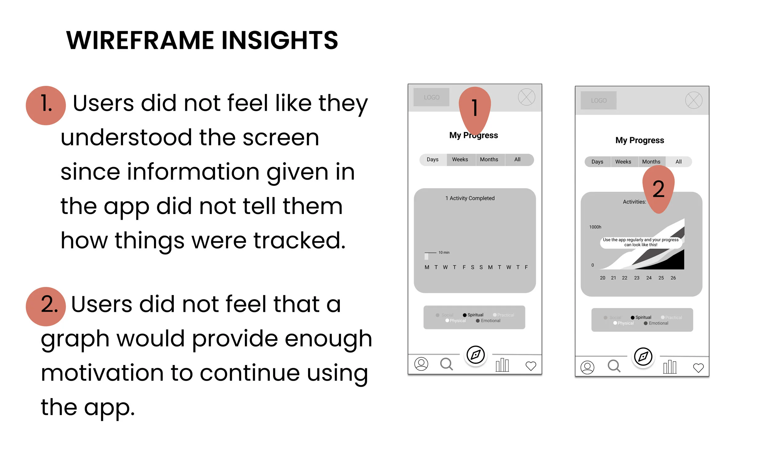
After receiving feedback, we added a key at the bottom of the My Progress pages so users could easily reference what pillar they were focus on. Keeping consistent icons on the Profile page that matched with the bottom menu was an important feature so that users could see they did not have to go to the profile in order to access some information like My Progress or My Library.
User Testing
We conducted usability testing to see how our three focus areas resonated with users at various stages of designing the app.
educate
Scenario: Since the pandemic, your stress has increased and you’re looking for a way to discover and maintain stress relieving tactics. Your friend suggested trying a new app to help you.
Task: Complete the on-boarding process for the app.


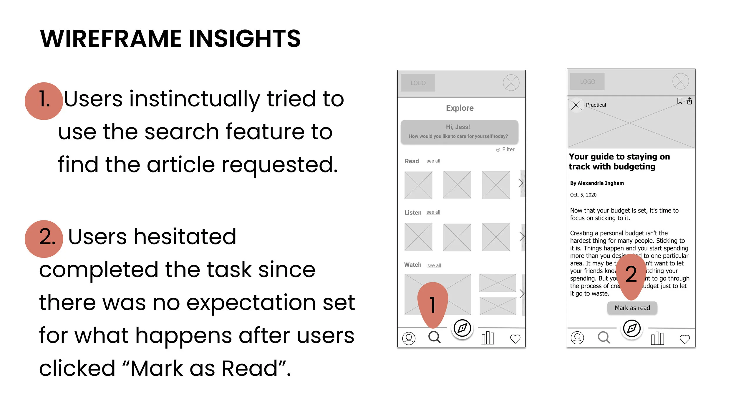
discover
Scenario: As part of your promise to prioritize self-care, you are aiming to find more practical ways of relieving stress. This week, you’re looking for tips to help you budget.
Task: Walk me through how you’d find an article about budgeting.

Track
Scenario: You are thrilled about your first step to prioritizing self-care and want to see hoe your progress is reflected in the app so far.
Task: Walk me through where you might find the status of your progress.

Results
The success of both rounds of testing were measured by three things:
How well the user understood the definition of self-care provided by the app
How users felt about the variety of self-care activities available
How easily users could identify the tracking method
With this metric in place we were able to determine that all users tested felt that the definition of self-care used by the app was easy to understand. All users tested also appreciated the different ways in which they could complete a self-care activity and said that the tracking feature was the defining reason they would return to Pillars.
Experience the prototype here:
Retrospective
Overview
Our team felt very happy and satisfied that we designed a solution to the problems many may be facing with staying on track with a self-care routine. We believed out design helped users feel reassured in what we considered self-care and how we could help them discover new practices and learn how to track their activities.
What Went Well
The initial idea of the problem space we wanted to address and what the app should focus on based on market research came very naturally to us. The team was very communicative and organized, which helped a ton with meeting goals and staying on track with the project timeline. Time boxing and taking daily notes helped us stay focused on the project and achieve our deliverables. The team overall had a common approach to collaboration that really helped move the project along.
What I Learned
I personally have previous web design experience but designing a native iOS app was more challenging than I thought it was going to be! There are some standards in apps that I was not familiar with even as an iOS user of many years so actually testing other apps in the self-care space was helpful to see what was common in that market.
Unlike a website, apps have a slightly different flow so many pages I designed were actually cut from the project once we started to understand the user flow and build more accordingly. This was a little disappointing but learning how limited and direct a flow for an app can, or should, be was extremely valuable. In the future, I would probably push to spend more time building a precise user flow before designing anything even at a low fidelity stage.
Overall, the team worked really well together and we all learned a ton by getting out of our comfort zone and designing a native app for iOS. There were a lot of challenges for me to not use mobile web design practices and I feel like a grew a lot from this project.
Next Steps
This project left off at a very positive and promising place. Our next steps as a team would be to figure out how content for the app would be created. We had briefly brainstormed on a few ways this would happen but would need to finalize any choices on how that content would be made. Continuous testing of our definition of self-care for the app would be necessary as well. Expanding the group of users tested would be a critical to insure our key points are getting across to a wide variety of users and also assist in helping iterate and improve our current ideas while allowing for new solutions to be discovered.