Cookin Thyme
Recipe Library - Responsive website
TEAM: Casey Auve, Caitlin Hartung, Todd Gilbert
TOOLS: Paper, Google Suits, Miro, Figma
TIME FRAME: 2 Weeks
ROLE: Assisted in all parts equally, main focus was on the UI design of the Home and Search pages
BRIEF: Your team has been hired by a client to create a new website that solves problems for real users on the topic of discovering and selecting recipes.
SOLUTION: Adjustable ingredients and portion sizes on every recipe to customize a meal to user preferences. Quick to access recipe inventory for future use.
OVERVIEW: Cookin’ Thyme is a website centered on helping users find, alter, save, and share recipes quickly.


Research
We began our search for target users by sending out a screener survey to find people who use recipes often when they cook. Our qualifying criteria was anyone who cooked 20 or more times in the last month and who followed through with using a recipe 10 or more times in the last 30 days. Once we found users who met these qualifications we conducted interviews to find out more about their process of using recipes when cooking.
From these interviews we pulled out key information and began looking for trends. From these overall trends we identified we were able to create I Statements that helped us narrow down and pull out more clearly defined insights.
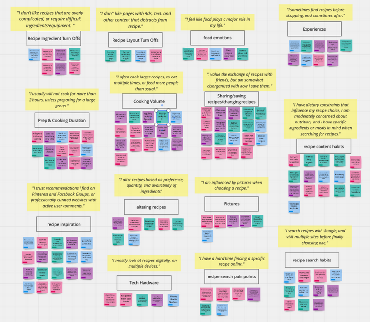
Insights we gathered from the interviews were:
Users like straightforward recipes without irrelevant content.
Users like to alter recipes based on serving size and ingredients.
Users look for recipes based on dietary restrictions and availability of ingredients they currently have at home.
Users rely on search engines to find recipes but have more trust in recommendations from social networks.
From the insights we were able to gather, we could better identify a persona for the project. This persona helped guide us through the project and add a more human element to our design process.

Identify Problem
From the information we identified about our user and their experience in the process of looking for recipes online, we formed a problem statement to assist with staying grounded to their needs:
Users need a more organized way to search for, edit, and save recipes so they can focus on the aspects of cooking they enjoy.
From this we began to hypothesize ways we could address this problem. Users lets us know they needed a way to search and organize recipes better, while also being able to make adjustments based on dietary needs or portion sizes. They also let us know that they preferred recipes without added stories and recommendations from those they trust. These were all user needs we wanted to meet with our design.
With a persona created and a problem identified, we were able to make a journey map that helped us better understand the .

Ideate and Sketch
Sketches
We conducted a design studio to brainstorming ideas for the defining features of the site. The ability to alter, search, and share recipes were features that stuck out to us very early on and concepts on how to implement them came quickly.

Early Sketches For Recipe Alteration Feature and Search and Filter System by Caitlin
User Flow
We began ideating on our solution with creating a user flow. Identifying how users may go through the site helped us understand where to best place certain features.
Design
Wireframes
Giving users a quick way to access a recipe inventory was the most important feature. We wanted explored ways to optimize defining features in that inventory such as alter, search, save, and share.
Guest Share SMS Option by Caitlin
Guest Share Email Option by Caitlin
Sign up Option by Caitlin
The ability to save and share a recipe was very important to our users so we explored several options for this. We provided users with the ability to create an account and save directly to the site or send the recipe other ways while using a Guest status. Sharing the recipe on social media, through messenger, or sending a link directly to their email or via text message were options provided in the Guest status.
Social and Browse Pages by Casey
Having a social feature where users could connect, rate, and browse recipes other users had tried came heavily from feedback around many going to other social sites for recommendations. Implementing a social feature within our own site would give users a trusted place they could reference recipe ideas.
Home page variations by Marissa
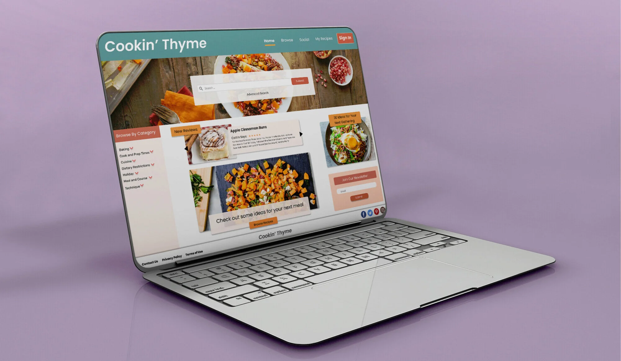
Early homepage search options had quick filters available along with an additional search button in the menu. The quick filter options were based around popular trending diets to help users find recipes that met certain needs.
Search page and results by Marissa
Due to the consistent feed back around reviews being important to users, we added Average Review Rating as something to explored as a filter option on the search results page. Highlighting the top result with different view options of the remaining results were approaches we wanted to explore given the visual nature of users selecting recipes.
Recipe page designed by Todd
Having particular ingredients and serving size able to be altered was an important focus for the site and this early iteration of the feature explored options for implementing that.
User testing helped us see organization of the page and number of options was something to look into improving.
Increasing Fidelity
The feedback we received from testing the wireframes was heavily focused on adding clarity around the recipe alteration feature. We redesigned this page and raised the fidelity to give life to the project and further test how users responded to the new design.
Recipe Page by Caitlin
Serving Size and Ingredient Adjustment Feature
Recipe Directions
User Reviews and Ratings
Home Screen by Marissa
Search page by Marissa
Save and Share Login Flows by Caitlin
Mobile
Making Cookin Thyme a responsive site was to benefit users who access recipes both on a desktop or mobile device.

Mobile home screen by Marissa
User Testing
We conducted user testing at multiple stages in the design process to see how our focus areas of search, alter, save, and share resonated with potential users.
Search
Scenario: You are planning on making a dish for your grandma and her friends, some of which have a gluten allergy.
Task: Find a recipe for gluten-free Chicken Piccata.


Alter
Scenario: The recipe you like is not for the same amount of people you need to cook for.
Task: Adjust the recipe to accomidate cooking for 5 people.


Share & Save
Scenario: Everyone loved the recipe! One of grandma’s friends asked for a copy of it.
Task: Save the recipe for you to use again later and send a copy of it to the email grandma’s friend gave you.


Checkout the prototype here:
Retrospective
Overview
Our team felt satisfied that we designed a useful solution for our users. We believed that our design provided a useful site for users to not only find recipes but to also alter, save, and share them as well.
What Went Well
The team collaboration and motivation went really well with this project. We all activatly communicated ideas and feedback on designs and deliverables within an open slack channel. The brief itself offered a fun and relatable subject that allowed all of us to be a little more creative with our solution.
What I learned
This was my first collaborative project so it was an exciting adjustment to work with others to create a solution. The target user felt like someone we could all relate to so the research and persona building was extremely enjoyable.
There are always some issues when working on a team, though, and we did encounter that. I was the only one with previous web design experience and some of my wireframes did confuse other team mates even after explaining them. In the future, I would probably design more with my team’s skills and preferences in mind instead of at my own level of understanding to avoid any delays or confusion. Overall, this project was a really good learning experience for addressing and correcting these kinds of concerns in the future.
Next Steps
This project left off on a solid spot but we saw an opportunity to provide value to the site and incentivize users to return by incorporating a community feature where users could see reviews left from others and follow each other for future recommendations if they so choose. we would want to explore this feature more and make changes based on user feedback. Testing further is our biggest area of opportunity so that we can build on, and better meet, user needs while adding value to the experience of using our site.