
KOALA
Timeshare Rental - Responsive Website - Business Consultation
TEAM: Ben Levy, Elena Levy, Myself
TOOLS: Paper, Google Suits, Miro, Figma
TIME FRAME: 2 weeks
ROLE: Assisted in all parts equally, main focus was on the UI design of the Homepage
BRIEF: Work with a client to assist with identifying and improving areas of opportunity with their product.
SOLUTION: Created a working primary persona based on user research, along with improving user experience around searching, seeing value and availability of property listings, and overall language used on the site.
OVERVIEW: Reworked the home page and presentation of property listings based on primary persona needs.
Research
About The Company
“KOALA is a small company founded and based in Brooklyn, New York. We want to transform the way people take vacations. Our goal is to make it easier for travelers to rent timeshares at beautiful resorts and help timeshare owners cover expenses for a space they can’t use.”
KOALA is offering a more casual approach for taking luxury vacations with an emphasis on security and reassurance in purchasing through them. Timeshares are often looked at as either something outside of the average person’s price range or a scam and KOALA wants to clear up those misconceptions. Operating in a fairly new market for vacation property rental, KOALA has their finger on the pulse of what matters most for both those looking to offer their property for rent and those looking for their next vacation stay.
Persona
KOALA provided a branding guide that included three personas they want to target - the primary being a millennial mother. This was chosen as the primary persona based on research supporting mothers often being the planners for family vacations and the millennial age rang of 25 to 40 being the dominate demographic for taking vacations.

Persona provided by KOALA
This persona was created on limited user research so KOALA tasked our team with defining the persona further. KOALA provided several recorded user interviews they conducted themselves, along with contact information for people who have used their services previously and agreed to being contacted for possible interviews. We also sent out surveys to find additional participants that met our criteria.
We poured over the information from these interviews and began looking for trends to discover insights that would help us narrow down some behaviors for our persona.

The insights we gathered from these interviews were:
Users do a lot of research before booking and believe timeshares are out of their budget.
Users will book a stay based on kid friendly amenities.
Users prefer apartment like amenities and flexible cancellation options.
Users are very budget conscious and do not want to spend more than $255 per night.
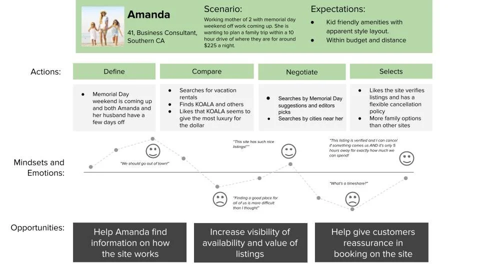
This helped us get a better picture of who our primary persona is for KOALA. Building off of the assumed persona, we narrowed down some behaviors and created a new persona - Amanda.

Persona created by our team
Identify Problem
From the insights we gathered through building the persona, we identified a problem to help guide us in our process.
Mothers need a trustworthy one stop shop to book family friendly accommodations with flexible cancellation policies that are within their budget because family travel planning is overwhelming, time consuming, and full of misleading results.
This problem helped us stay grounded to the primary persona while hypothesizing solutions. Bringing important information to the forefront of KOALA’s site to help build trust with the user and make their planning less overwhelming was the biggest take away. Finding out how to best present this was our next task and we looked to market research for the answer.
Market Research
We began out market research by looking at some direct and indirect competitors. Identifying some key industry standards for searching, displaying value and availability of the listings, and the overall verbiage being used across the landscape will help to identify where KOALA is meeting that standard, but more importantly, where they can stand out.

Heuristic Analysis
Overall, KOALA only had minor problems found by a heuristic analysis. Many were simple adjustments that could be resolved with a deeper connection to users. For example, the search option on the home page does not allow for users to freely type. That is an anticipated action a user would make when interacting with a search feature. Accessibility was were we found the biggest area of opportunity. Many users may need screen readers or other forms of assistance to help browse the internet and KOALA could help reach that demographic by ensuring their site is meeting standards applicable to the technology used by many with disabilities. Ensuring all images have alt tags, for example, could be an easy way to improve accessibility of the site and what KOALA has to offer.
Journey Map
With a persona created and after identifying some standards of the industry and where KOALA stands out, we were able to create a journey map for Amanda. This helped us better identify some areas of opportunity for KOALA to really resonate with their primary user and pull them in to their product.
Ideate and Sketch
Sketches
Early ideas for improving the homepage were largely centered around the presentation of the listing cards. User feedback helped us understand what was the most critical information needed to entice a user to look further into a property listing and we wanted to tap into that as best we could.

Wireframe

Homepage wireframe
Wireframing a new design for the homepage was largely centered around making it easier for users to find and understand what KOALA had to offer so they would want to explore the site more. We tested a few ideas with the placement of information and stripping down the amount of areas advertising properties.
Centering Top Packages around a reasonable price point many users provided us as a guideline for their personal trips, along with reconsidering the presentation of information on the listing cards, was a big priority. Users want a glimpse at how affordable listings are right away so moving this further up the page was an important change to us.
Limiting scrolling both vertically and horizontally on the homepage was a consistent move for us. Cleaning up margins and padding in many areas helped to tighten up the look and feel of each section.
A lot of the user feedback around our changes was very positive and allowed us to iterate further on the direction we were going in with an increased fidelity prototype.
Design
You can take a better look at the original Homepage design here. Below is an overview of the changes we made. To skip ahead to a section, click on the bold text.

1.Header - cleaned up margins and padding, added accolades and number of guest option to search
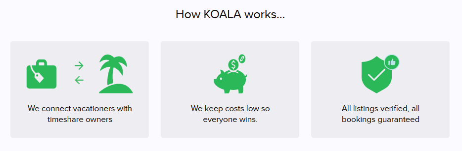
2. How It Works - added more clarification to process with info graphic.
3. Travel With Confidence - cleaned up margins and padding to fit all cards without scrolling.
4. Where To Next - removed
5. Editors’ Picks - moved up the page to get more attention, reworked listing cards.
6. Testimonials - Cleaned up margins and padding, added KOALA mascot for reviews with no profile image.
7. Chose Your Own Adventure - removed
8. Plan Ahead - reworked direction to be more holiday focused.
9. Brands You Trust - moved up info for Timeshare owners
10. Footer - cleaned up margins and padding

Original Homepage(left), Updated Homepage (right)
The header offered a quick tagline and summary of what KOALA offers along with a search option. User feedback on this section helped us understand that this does give a professional feel to users while offering a direct option to find what they are looking for.
We did not want to adjust much with this section since it did accomplish what KOALA wanted. Since many users expressed to us they often book for families, adding a filter to the search that would allow selecting a number of guests would be benefitial (1). We did move the accolades collection up to be featured in this section to increase the professional and legitimate feel that the original header was already giving users (2).

Original How It Works (left), Updated How It Works (right)
User feedback around the current section on the homepage that provided information on how KOALA works was mixed. Many understood it but most wanted to see how they benefited from using KOALA compared to other options like hotels.
Looking at competitors and from user feedback on the How It Works section, we decided to turn the information into a more visual representation of what KOALA offers (1). Many users let us know that they wanted something more direct on the process and how they benefit from the services and this was an approach we wanted to explore more of. Summarizing the process KOALA offers with more eye catching icons and straight to the point captions would pair well with a comparison graph to help users get a full understanding of what booking with KOALA would provide for them (2).

Original Travel With Confidence (left), Updated Travel With Confidence (right)
Many users expressed to us that having the confidence in the service and booking location was a very important thing for them. On the homepage the Travel With Confidence section was very well received. The current section featured wider sections that required the user to scroll to view all the information (2). To make this information fully visible for users, we decided to reformat this so all sections were visible and no scrolling was necessary (1).
We decided to remove these sections following user feedback around too many sections on the homepage advertising options around listings. Many users felt overwhelmed or confused buy multiple sections set to accomplish the same thing so we wanted to remove some that were not centered around reasons our primary persona used to book a vacation.

Original Editor’s Pick (left), Updated Editor’s Pick (right)
The original Editors’ Pick section was a larger section further down the page that highlighted current deals on KOALA and centered around a much larger listing card.
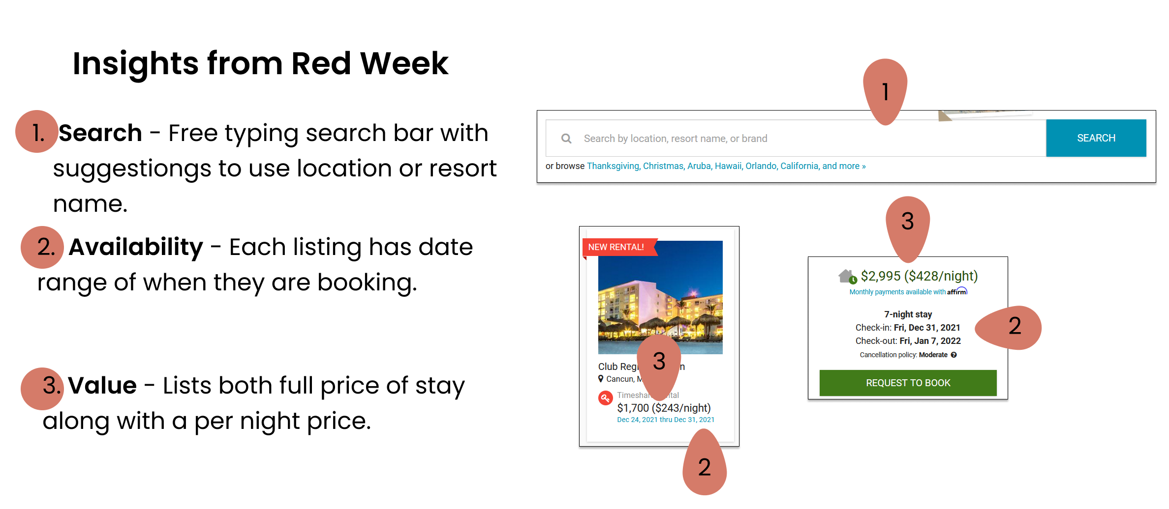
From user feedback on the Editors’ Pick section, we suggested moving the section higher up on the page to get users attention quickly and centering the information around what users tend to look for in listings. Keeping Google ratings (1), How many rooms and nights (2), and the price per night (3) highlighted since they were the most common factors users looked to explore a listing further. Moving information like verification (4) to the expanded details of listings made the most sense since it was something users liked but was not a factor when they were choosing to look at more information.

Original Testimonials (left), Updated Testimonials (right)
There were limited testimonials on the current homepage and few had images uploaded with them. The lack of image or branding with the testimonials made it seem out of place on the homepage and did not resonate with users.
KOALA had images of a mascot in the branding guide they presented us but it was sadly not present on the sire. We decided to implement that mascot as the placeholder image for the testimonials to give them more of a inviting personality that users could connect with (1). The testimonial section also seemed a bit oversized. We tightened up the presentation to give the section a more streamlined and organized look (2).

Original Holiday Highlight (left), Updated Holiday Highlight (right)
KOALA had user data supporting advertising around holidays and created a section centered around pulling locations that are often available during vacation seasons. The original section had both holidays and popular travel seasons for suggestions and we decided to bring the focus of this section just to holidays (1).
From our research we found that many users shop for vacations with a price point in mind. We updated the section to show a starting price so that it would appeal more to users and make them want to look further at packages KOALA offers (2). Focusing this section directly on holidays, instead of both holidays and vacation seasons, was something we thought would benefit users greatly (3). Tightening up and centering this section so users could see the additional option to view more holidays (4) was a suggestion we presented since many users did not notice that in the previous format.
This section contained important information that many users would still need or what access too so not much was changed here. We did, however, feel that it had a bit too much negative space and could use a little tidying up to help give it a streamlined look.
User Testing
We conducted usability testing to find areas of improvement on the current homepage. With our main goals in mind, we tasked users with scenarios to get critical feedback on both the current homepage and the redesign we created.
Language
Scenario: You are looking to book a vacation for your family soon. You come across KOALA’s site as you look for accommodations and possible vacation destinations.
Task: Review homepage and provide feedback on your understanding of what this site offers


Search and Value
Scenario: Find a listing under $200 a night.
Task: Walk me through searching the site for a listing at a particular price point.


Availability
Scenario: Find what types of listings are available in the month of November.
Task: Walk me through finding an available listing in a particular month.


Results
Both rounds of testing were measured by:
Users ability to understand what KOALA offered and how it operated
How easily users could identify the value and availability of listings on the site
How users felt about searching for listings on the site
With these guidelines established, we determined that the original homepage did clearly explain what the site offered but users would like to see it presented in a more visual way. Identifying value of each listing was clear to users and greatly improved with hierarchy adjustments. Availability of listings and searching on the site have some unique limitations connected to the nature of renting a timeshare property, the transparency around the availability of listing because of this could be refined so that users better understand how listings are presented.
View the prototype for the new homepage here:
Retrospective
Overview
The team felt very happy and confident in the persona and redesign for the homepage we delivered to our client. The newly defined primary persona and research surrounding feedback from the previous homepage design will help KOALA with the future of their product from the user perspective.
What Went Well
KOALA was extremely hands on with our team during the entire process and having their direct input throughout the sprint was extremely helpful for understanding their branding. Our team never had to guess how KOALA felt about any of our purposed ideas and communication was very fluid and professional, which helped us feel like part of the team and work confidently.
What I Learned
Working with an existing brand in a UX space was very new to me. I had previous experience following style guides for companies but iterating over current designs or branding was very new territory and thankfully working with a very involved client helped guide myself and the team through this new challenge. Communication is the most valuable skill when working with a client and this sprint really helped provide an example of how important good communication can be.
Next Steps
This project left off on a very positive note. The next steps for this would be to get more feedback on the homepage redesign and then move on to the property listings and additional personas. Due to the limited time frame we were not able to dig further into how users felt about the presentation of listings and I would love to get feedback and see how we could improve that for KOALA. A secondary and tertiary persona were also presented and would need to have additional research to define them properly so they could also be catered toward when considering design choices throughout the site.